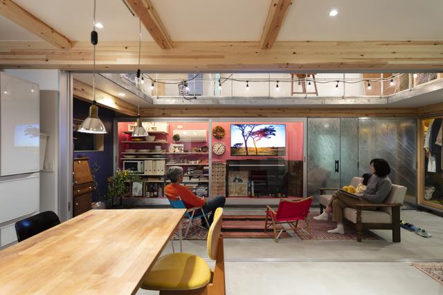
One of the most important aspects of interior design is lighting. However, good lighting is especially important for smaller or more crowded spaces, even if their size does not change, making them feel larger and more open. Conversely, larger spaces with poor lighting may be smaller and less popular than potential spaces. In order to make the interior space feel appropriately large and well-lit, designers can rely on a variety of time-tested and authentic methods to make the most of the space, from using the correct shadows and lighting types to placing them in the best positions, and then perfecting other elements Fusion together. Existing lighting. A few examples of these strategies and their applications are listed below.
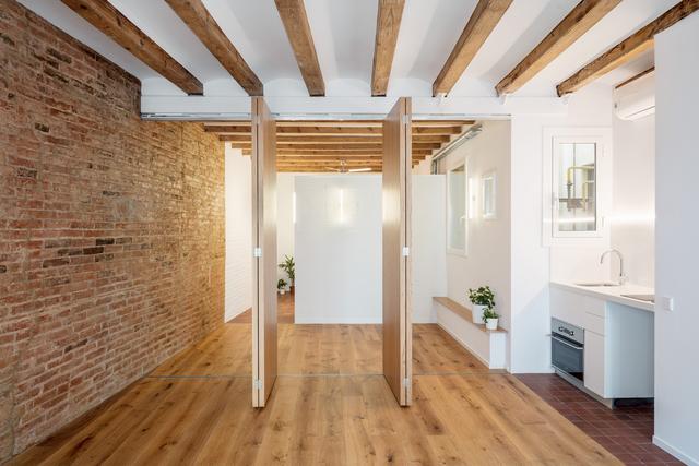
Use multiple light sources
Many residential interior spaces fall into the trap of using a single centralized ceiling light to illuminate the room. This type of lighting creates shadows, makes the room lighting uneven, makes the room feel smaller, and may even make your eyes tired. Designers should use multiple light sources distributed throughout the room instead of using a single ceiling light. The function, size and design of the room will require different lighting positions and intensities, but designers can follow some general rules when placing multiple light sources:

Put the light in the corner
Usually, darkness makes the space smaller, and brightness makes the space larger. When the corner is covered by shadows, the room appears to shrink. The lights in the corners, whether they are ceiling lights or strategically placed lights, will ensure that the entire floor of the room is illuminated so that it looks at least as large as the actual area.
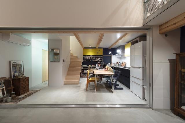
Implement layered lighting
Corner lights and other ceiling lights usually fall into the category of “general lighting”. However, designers should generally use three different types of light: conventional lighting, specific lighting and ambient lighting. General lighting can keep the room in good lighting condition, while special lighting can make users see better on specific points of interest (such as desks or countertops). In turn, ambient lighting has more decorative functions. Layering lighting in this way ensures that all three requirements are met. Therefore, designers should consider all three “layers” when distributing light sources around the room. Examples of specific lighting include under-cabinet lighting in the kitchen or vanity lights in the bathroom. Ambient light can be candles, recessed lights or decorative lights or declarative items.
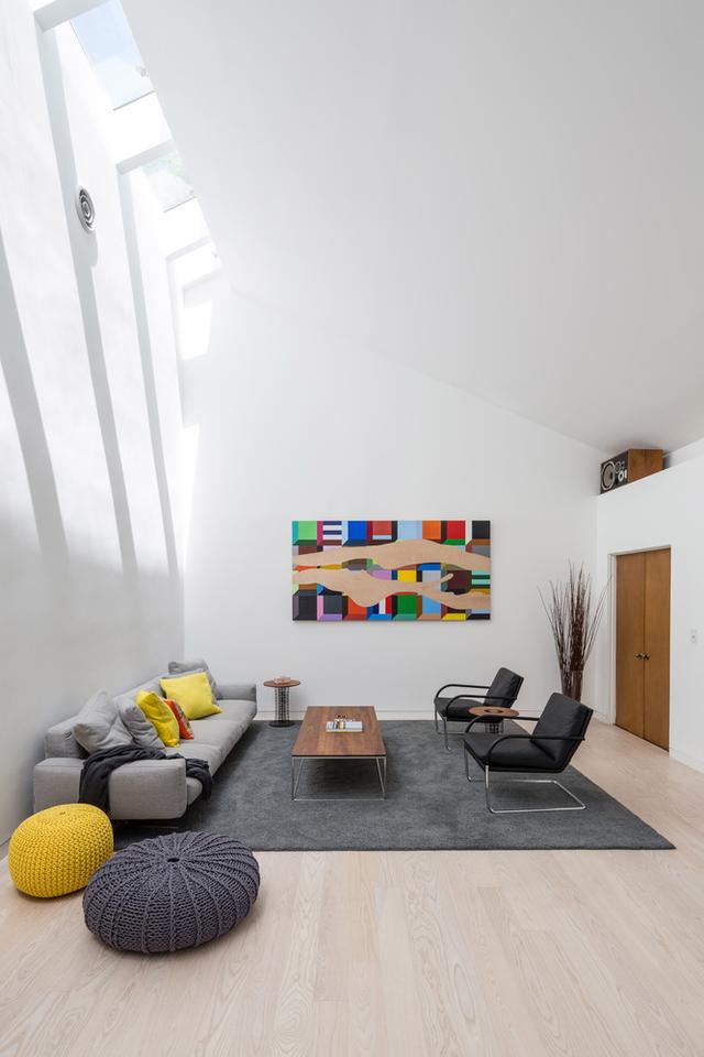
Add recessed lights
Recessed lights are particularly important because they actually make the space larger. Defined as lights installed directly inside the ceiling, wall or other surface, they add extra light without taking up extra space. These lamps are particularly suitable for rooms with low ceilings, as chandeliers or non-recessed ceiling lamps can make vertically dense spaces feel smaller. By hiding the lights, designers can increase the amount of open space, which can play a big role in smaller rooms.
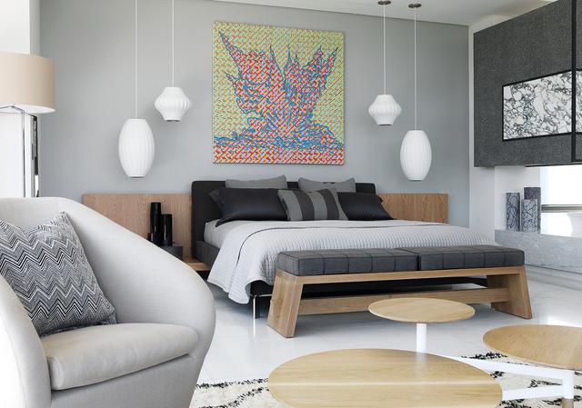
“Wash the wall”
Wall washing means directing light to the walls of the room, which actually expands the space by lightening the room boundary. It can also be used to direct attention to certain positive aspects of design, such as artwork or other architectural features. Recessed lighting is a method of washing walls, making it a double effective strategy. Another method is to install track lighting, which can be pointed at the wall manually.
Use chandelier for high ceiling
Guiding sight is not only suitable for washing walls, but also for emphasizing high ceilings. The chandelier draws the line of sight upwards and makes users notice the high ceiling, thereby making the tall space feel higher. High furniture, high shelves and vertical wall lamps can also be used to emphasize verticality.
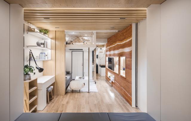
Design with light and backlight
At the same time, upward lighting can be used to emphasize high ceilings or make low ceilings feel higher. This strategy can be applied only by directing the light upwards (just like directing the light horizontally when washing a wall), and can be simplified by a lampshade facing upwards or some types of special bulbs. At the same time, backlighting is to add light behind certain furniture objects (for example, cabinets, wall troughs, displays, screens, and other personalized objects). This creates the illusion of depth, which not only makes the space feel larger, but also makes the design more complex.
Install track lights
Track lights are another strategy that requires careful observation. These methods combine many of the methods listed above: they are small and save space. Versatility means that they can meet specific or general lighting needs; movable, allowing them to highlight certain functions; and arranged multiple times, if the arrangement is correct, the entire room will be illuminated.
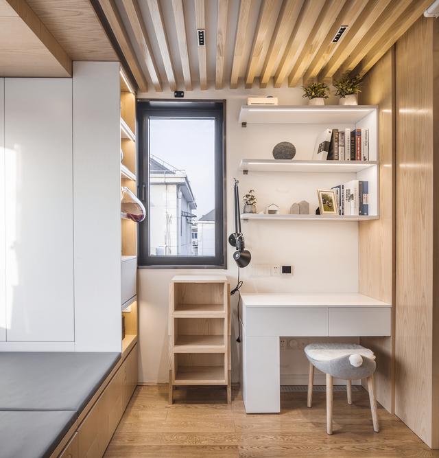
Add mirrors or other reflective surfaces
Mirrors are a well-known way to make a room feel larger because they double the visible space. They also reflect light, which further expands the space and naturally enhances brightness, thereby further reducing shadows. The bigger the mirror, the better the effect. However, designing with relatively reflective materials can also make a big difference. For example, smooth floors (such as polished floors) and even smooth surfaces such as glassware can help reflect light, enhance light and redirect light throughout the room.
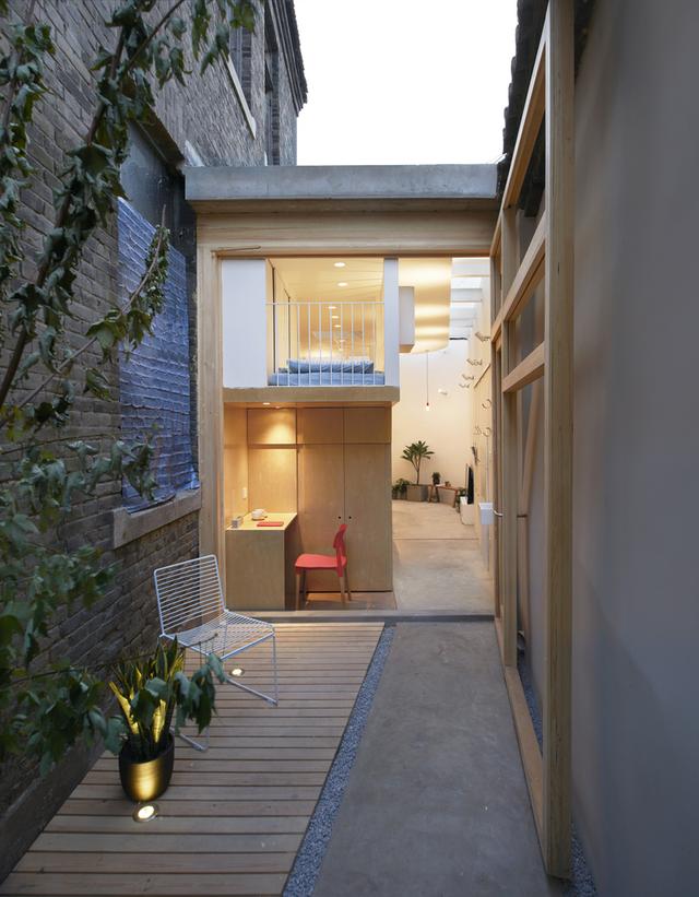
Use lightweight furniture and walls
Finally, lightweight furniture and walls are critical to maintaining the brightness and reflectivity of all other design strategies. This has a long way to go in enhancing good lighting effects, and dark walls and furniture can absorb all the extra brightness produced by strong, evenly distributed lighting and reflective elements.
